Nida Trust
#226e36
Signature
#5ca544
Support
#a53c3b
Accent
#f0ede7
Ground
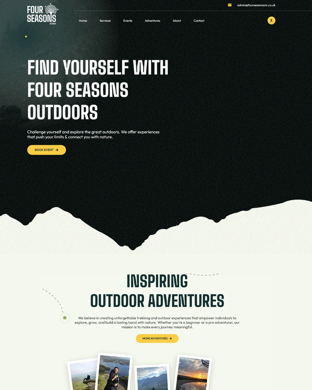
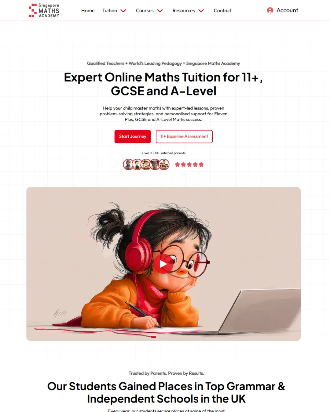
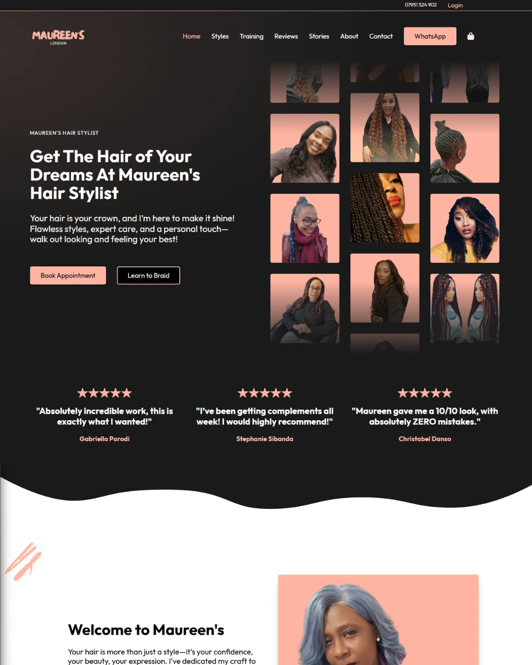
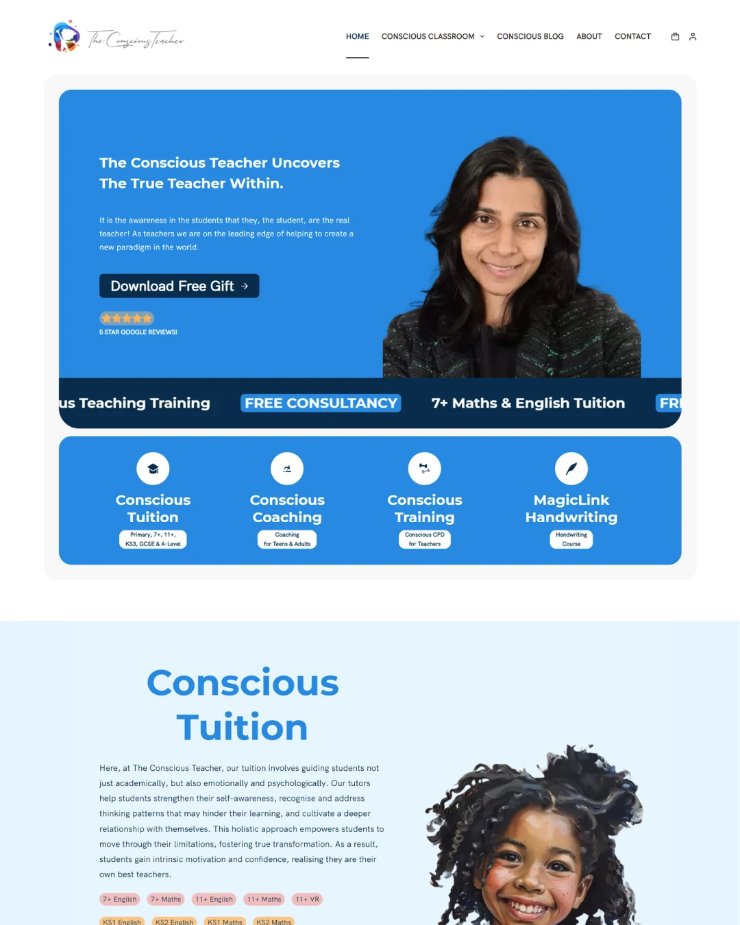
Nida Trust is a charity supporting school teachers across England and the wider UK, with a particular focus on teachers from the Muslim faith. They came to us in their twentieth year wanting a website to mark it. The logo stayed as it was; everything around it was redesigned — colour, type and the overall look. The build gave them an events section they manage themselves, a projects section, an about page carrying their governance and trustees, a home page banner they can change without us, and a home for the talks and seminars they publish to YouTube. An awards ceremony page followed later as after-service support.
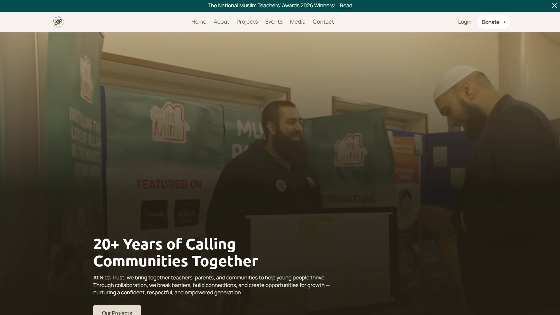
Where they began
A site only a few years old that had already gone wrong — broken pages and sections throughout, and problems underneath it that made leaving it in place a risk. Their twentieth year was the reason to rebuild rather than keep patching. The logo was staying exactly as it was, so the redesign had to work around a mark that was not up for discussion.
What was hard
Twenty years of work to represent, and several different kinds of content to carry: events, projects, the people responsible for governing the charity, and a growing library of recorded talks. All of it needed to stay current, and all of it needed to be maintainable by the team rather than by us.
There was also ground to make up. The site being replaced was not old, but it had stopped being sound — and for a charity, where people are deciding whether to trust you with their time and their support, a site that feels neglected costs more than it would for most businesses.
The anniversary set the standard. The site had to read like twenty years of work rather than a brochure, and it had to do that without a new logo.
What we built
The brief was ownership. Almost everything on the site is theirs to change: the banner at the top of the home page, new events, new projects, and the trustees and governance details on the about page.
Events were deliberately built as listings rather than a ticketing system. The organisation runs events constantly and they are not selling seats — putting a checkout in the way would have added maintenance without adding anything they wanted. The most recent events surface on the home page so the site looks alive without anyone curating it.
The videos work on the same principle. They publish seminars, fairs and talks to their YouTube channel regularly, so the site draws on that channel rather than asking anyone to upload anything twice.
The awards ceremony page came after launch. They came back with twelve categories, thirty-three finalists and messages from the judges and trustees, and wanted the whole thing in one place rather than scattered across a series of posts.
The key parts
6 features we would like to highlight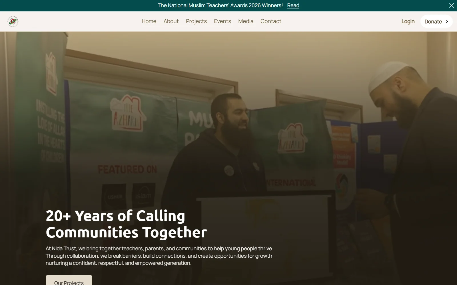
A banner they control
The panel at the top of the home page belongs to the team. They change the message and the image themselves whenever something new is happening, without coming back to us for it.
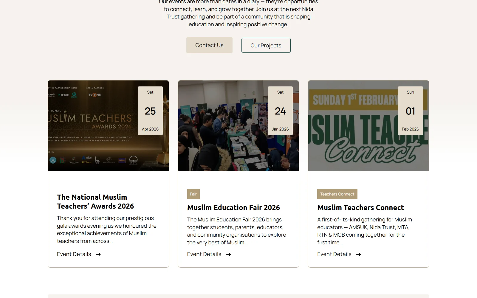
Events, listed rather than ticketed
The charity runs events constantly and is not selling seats, so events are listings the team add themselves — no checkout, no payment step, nothing to maintain that nobody needed. The most recent ones appear on the home page automatically.
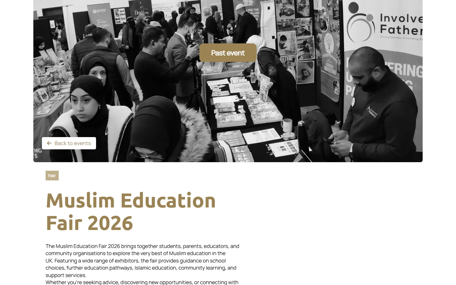
Projects the team add themselves
New work goes up as it happens. Projects are added and edited in the same way as events, by the people running them rather than by us.
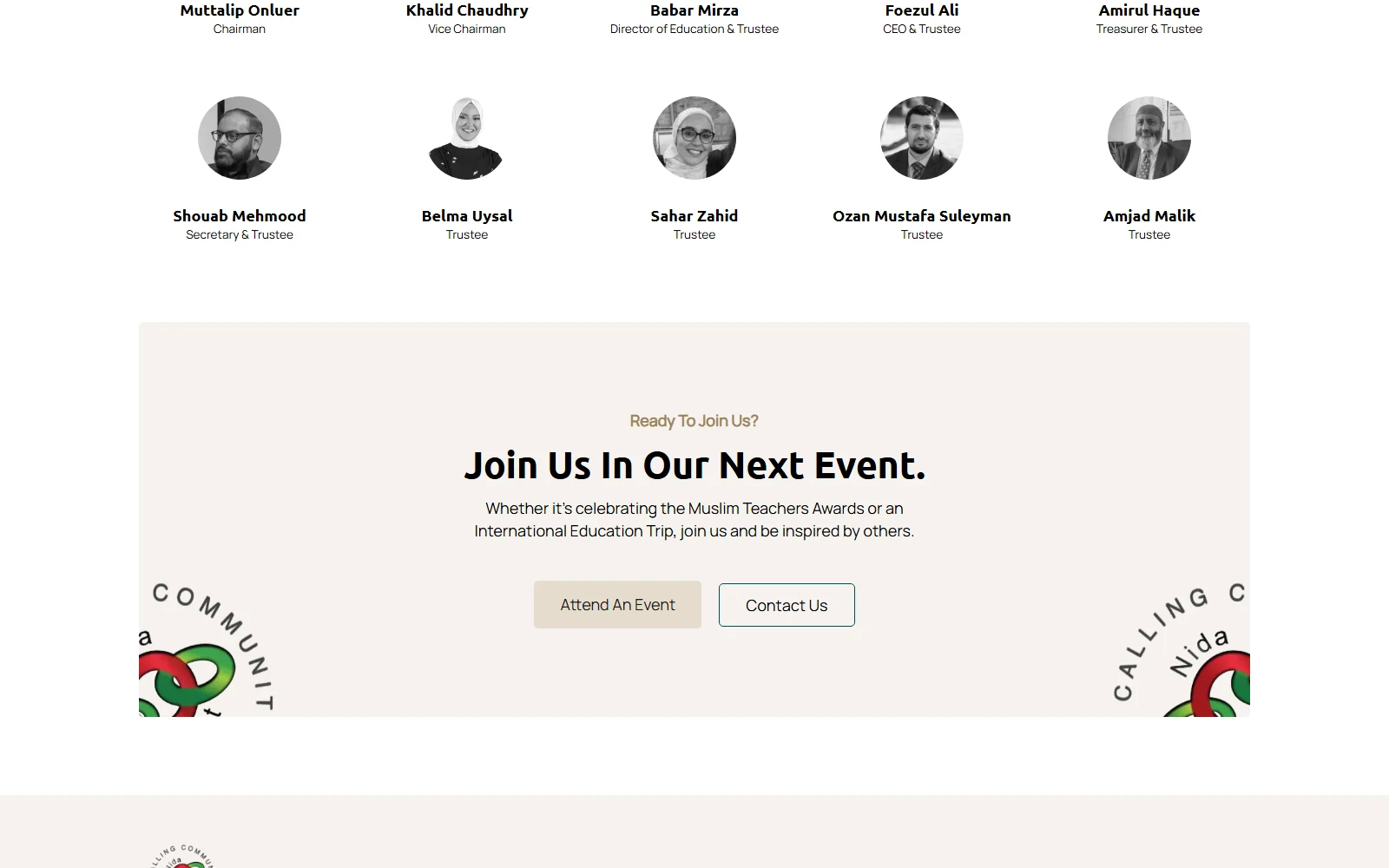
Governance in the open
The about page carries the charity's governance and its trustees, and the team can keep it current as people join and move on. For a charity that is not a nice-to-have — it is how people decide whether to trust you.
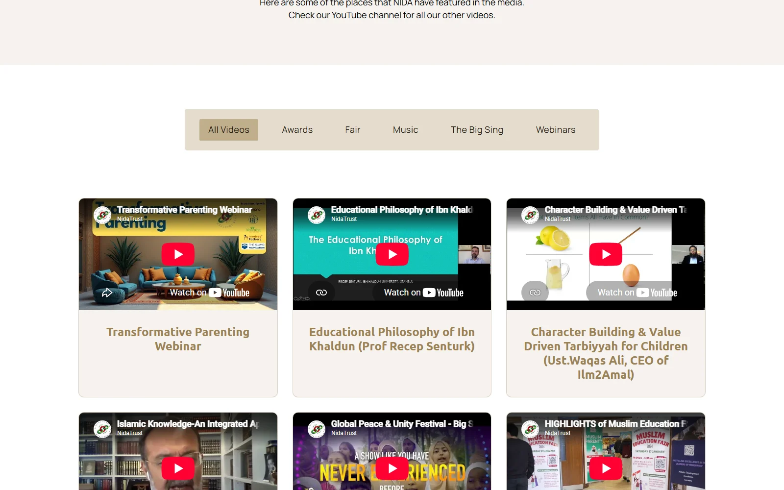
Their talks, on their own site
Seminars, fairs and sessions with lecturers, teachers and parents go up on their YouTube channel regularly. The site brings those in, so the work reaches people who will never think to look for a channel.
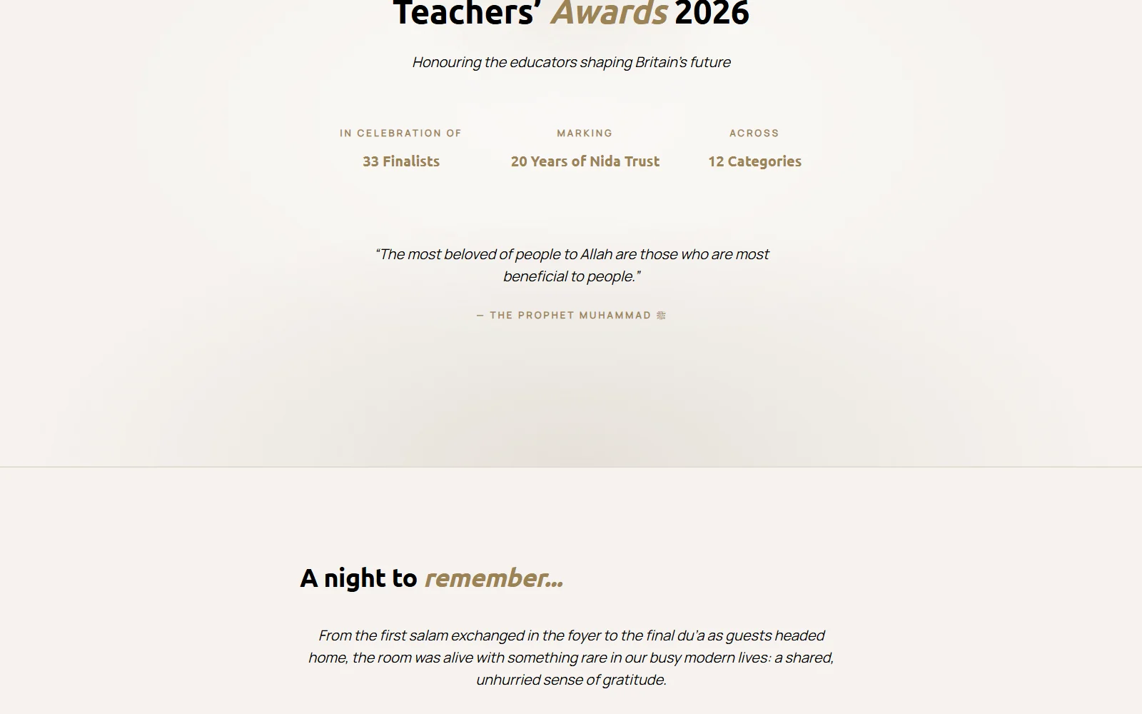
The awards ceremony, in one page
Twelve categories, thirty-three finalists, the winners and their placings, and messages from the judges and trustees — all held on a single page rather than broken up across posts. Built after launch, as after-service support.
What changed
A site that marks twenty years
A redesigned look built around the existing logo, so the anniversary reads as a milestone rather than a rebrand.
The team runs it
Banner, events, projects, trustees and governance are all edited in-house. The charity is not paying anyone to change a date.
Events without the overhead
A full events section with no ticketing or payment layer, because the organisation does not need one — less to maintain and nothing in the visitor's way.
A permanent record of the awards
The awards ceremony captured in one place, categories, finalists and messages together, rather than dispersed and lost after the event.
In their words
Pixelgbra have done an exceptional job on our website.
We are delighted with our new website which marks 20 years of service to the community. Pixelgbra listened to our needs and delivered a beautiful website that allows us to manage changes internally. Their handover and after care was also very impressive. We enjoyed the whole process and didn't have any issues, which was surprising!
Babar MirzaNida Trust