The Conscious Teacher
#002d4d
Signature
#0088e6
Accent
#80cbff
Support
#e5f5ff
Tint
#f5fbff
Ground
#2e2927
Type
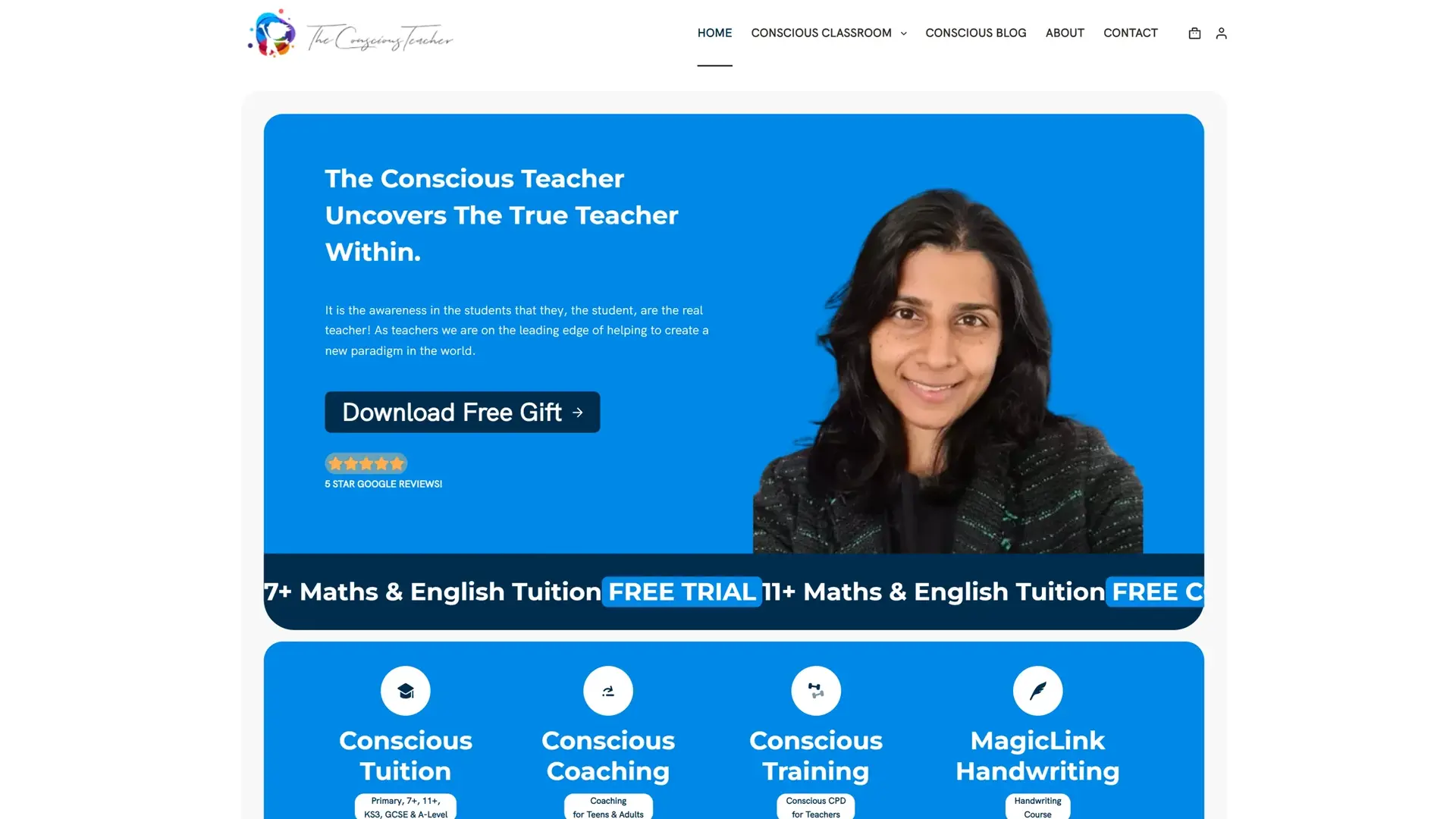
The Conscious Teacher is a tuition company specialising in 11+ and secondary education. We rebuilt and rebranded their website around three things that had to work as one: a shop selling books and digital resources, a learning platform delivering courses and online exams, and the tuition offer both of those sit inside. The logo stayed — it is a strong mark and there was no reason to touch it — and the blue it lives in carried through the redesign. We were called back later to redesign the book covers used as the product images in the shop.
Where they began
A founder who had been through a website project before and had a poor experience of it, losing both time and money. She was reluctant and anxious about starting another one. The logo was staying, so the redesign had to work around a mark that was already good.
What was hard
The first thing to solve was not technical. Rash had been let down by an agency before and starting again was genuinely difficult for her, so the work had to be visibly worth the risk she was taking on it — not eventually, but early enough to be reassuring.
Underneath that, the site had three jobs rather than one. A shop carrying physical books and downloadable resources. A learning platform running courses and online exams. And the tuition business that both of those belong to. Each is a build in its own right, and the danger with all three is that they end up feeling like three separate sites wearing the same header.
What we built
The order of the work followed the anxiety. Having been let down once, she needed to see progress rather than be asked to trust a process, so the build was structured to show something real early and often.
The shop runs on WooCommerce, covering the printed books and the digital downloads, with the basket and checkout designed in the site's own language rather than left looking like a bolted-on plugin. The learning platform carries the courses and the online exams. The tuition side ties the two together, so someone who arrives looking for a tutor finds the books, and someone who came for a book finds the courses.
Keeping the logo and the blue was a deliberate decision, not a constraint we worked around. The rebrand reads as the same company doing considerably better, which for a tutor whose reputation is the business is worth more than a fresh identity would have been.
The book covers came later. Once a shop is actually selling, the product image stops being decoration and starts doing sales work, so she came back to have the WooCommerce featured images redesigned.
The key parts
5 features we would like to highlight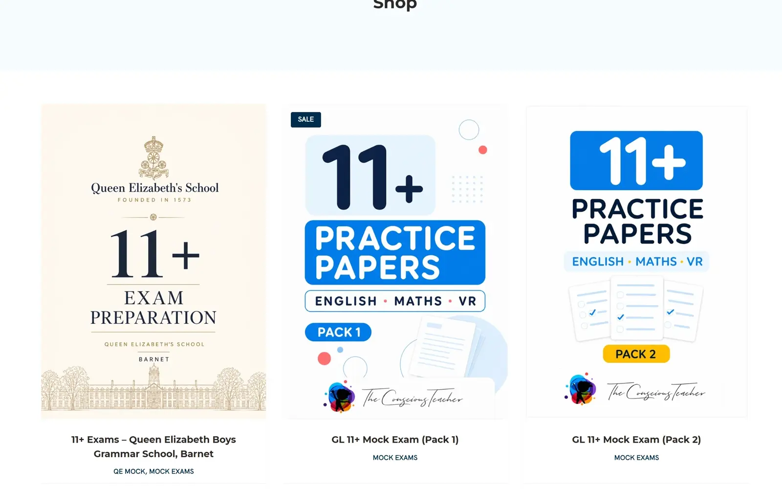
A shop for books and downloads
Printed books and digital resources sold through the same shop, with the basket and checkout designed to look like the rest of the site rather than a plugin someone switched on. Downloads deliver themselves, so a sale at midnight needs nobody awake.
Courses and online exams
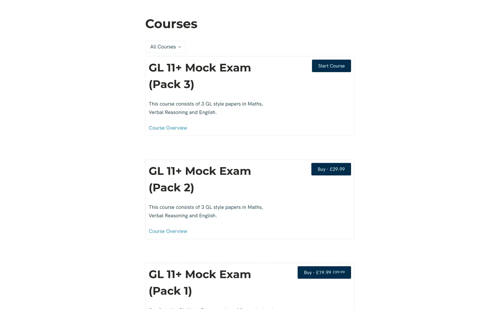
A full learning platform sitting inside the same site — courses delivered online, and exams taken online, rather than sent out as documents and marked by hand.
Three businesses, one site
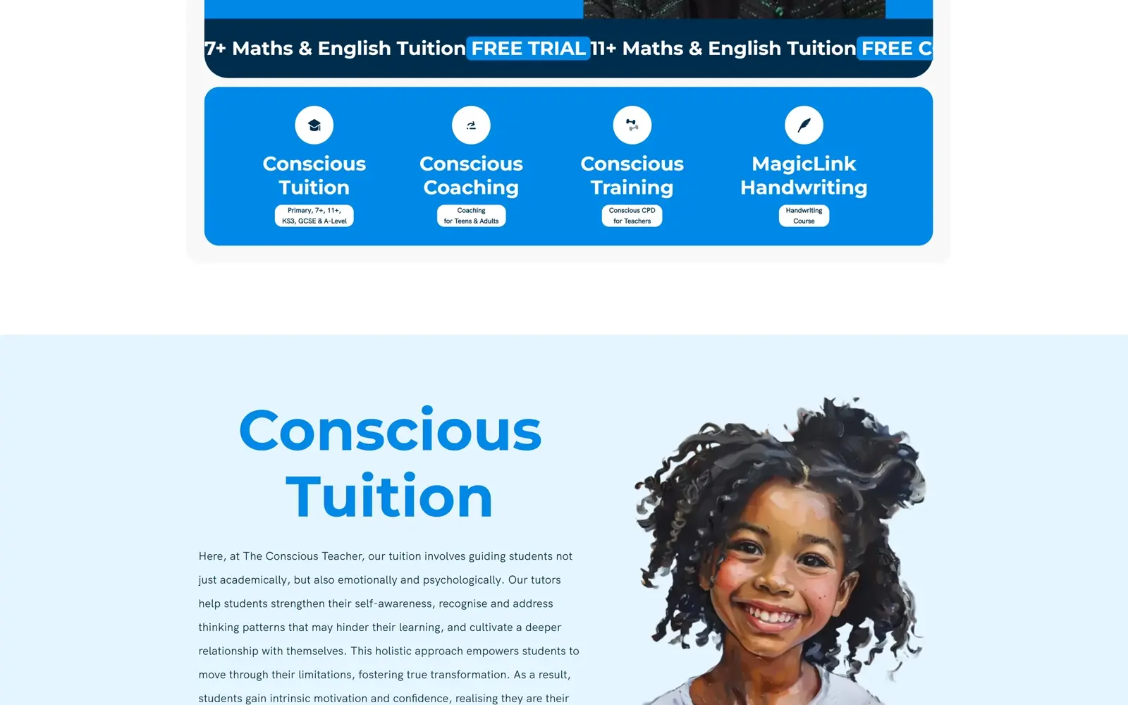
Tuition, the shop and the learning platform are separate propositions that share one journey. Someone arriving for a tutor finds the books; someone who came for a book finds the courses. None of it reads as three sites behind one header.
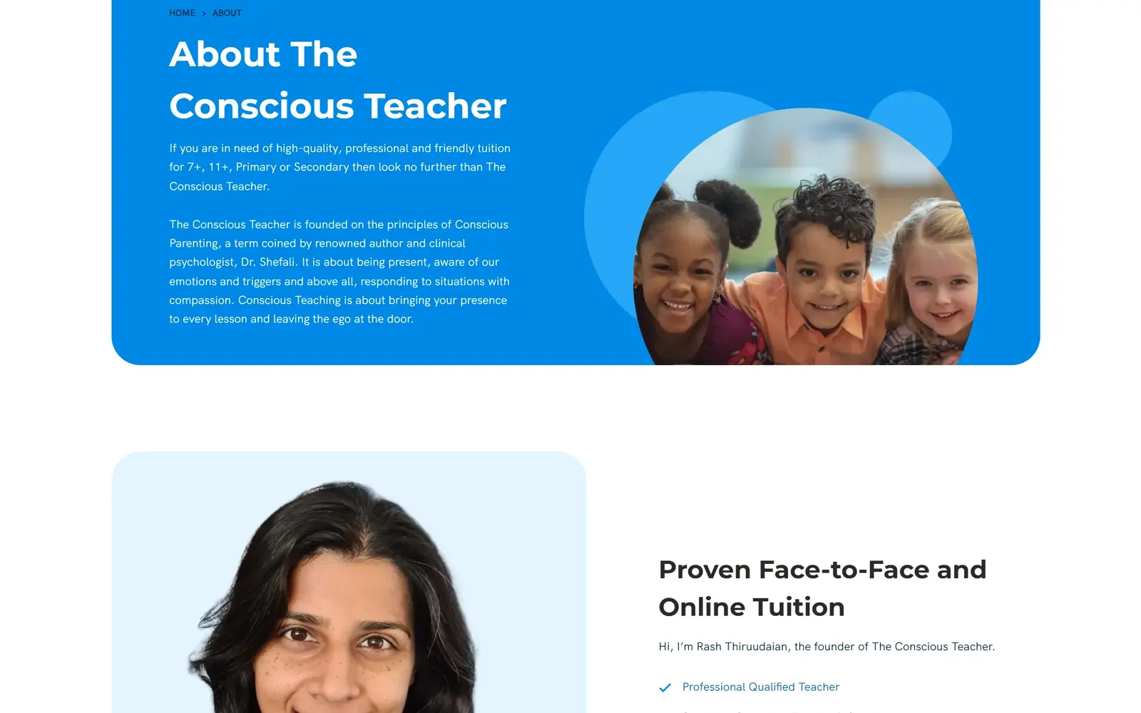
The mark kept, the setting rebuilt
The logo was already good, so it stayed, and the blue with it. Everything around it was redesigned — which lets the site read as the same company doing better rather than a different company entirely.
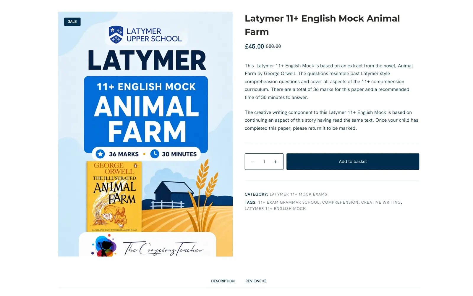
Book covers that sell
Called back after launch to redesign the featured images on the WooCommerce products. Once a shop is trading, the product image stops being decoration and starts doing the selling.
What changed
A reluctant client who came back
She started the project anxious after a bad experience elsewhere, and has since returned for further design work. For a client who was reluctant to start at all, that is the outcome that matters most.
Selling directly, without a middleman
Books and digital resources sold from her own shop, on her own terms, with the digital side fulfilling itself.
Teaching that scales past the timetable
Courses and online exams mean the teaching is no longer limited to the hours she can personally sit in front of a student.
A brand that grew rather than restarted
Same logo, same blue, an entirely rebuilt site — so the reputation she already had carried straight over.
In their words
Pixelgbra Studio were professional, extremely creative, and they did everything in such good time!
Pixelgbra Studio did an outstanding job on designing our website, theconsciousteacher.com. From the very first consultation right until the final launch, they demonstrated an exceptional awareness of my vision. They were professional, they're extremely creative, and they did everything in such good time. My whole brand and vision was resulted in not only a site that looks stunning, but functions so quickly and is really responsive, and I couldn't be happier with their service. I highly recommend, if you're looking to sort of update or refresh your brand, that you go to Pixel Algebra.
Rash ThiruudaianThe Conscious Teacher