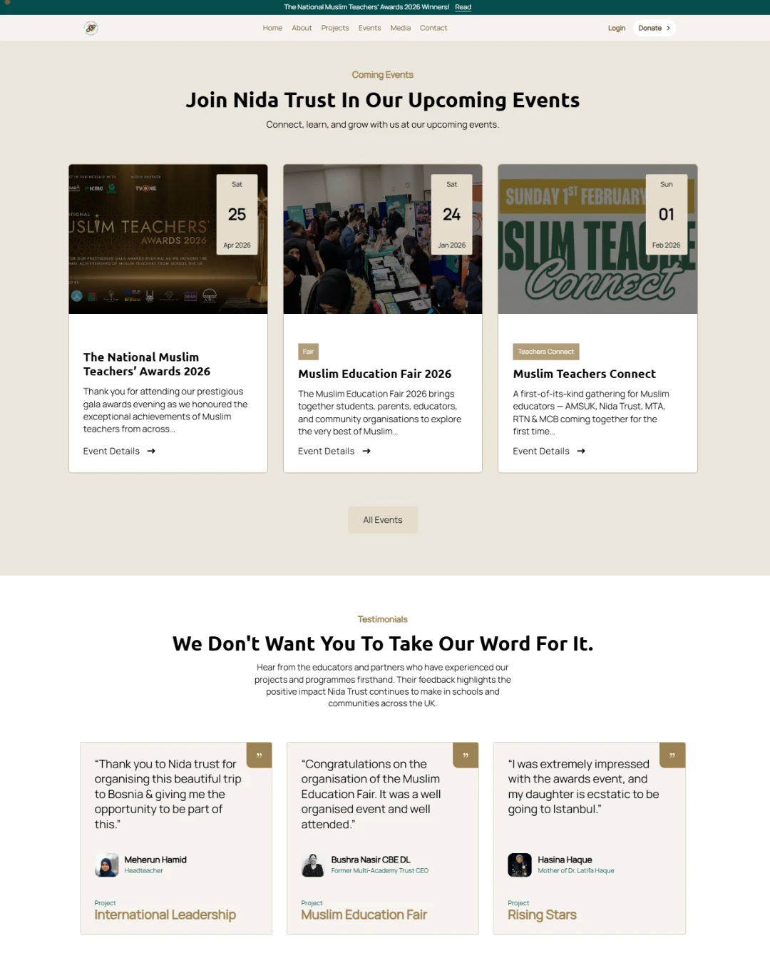
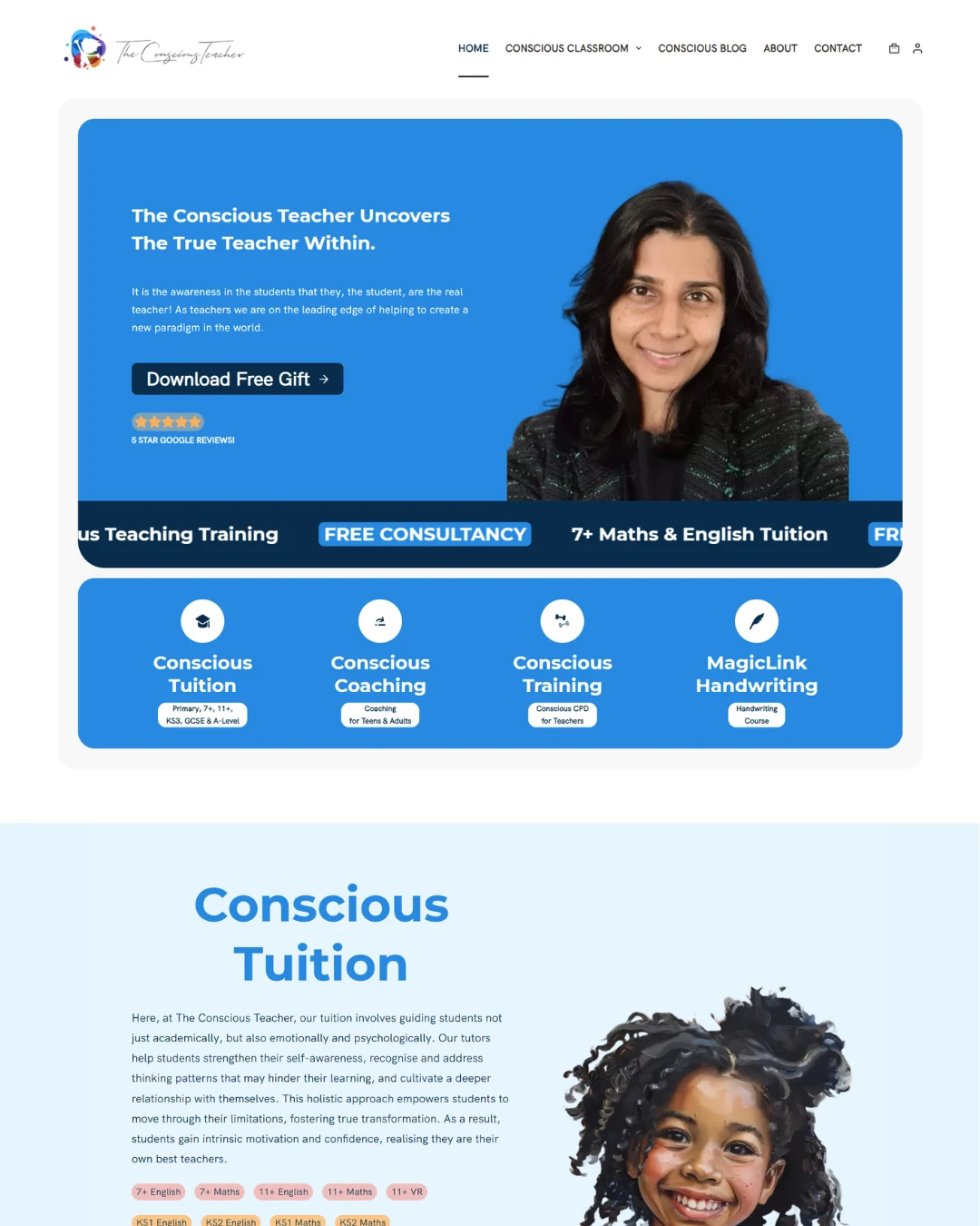
A and T Partners
#023e8a
Primary
#e6f1ff
Tint
#0a2434
Base
#000000
Neutral
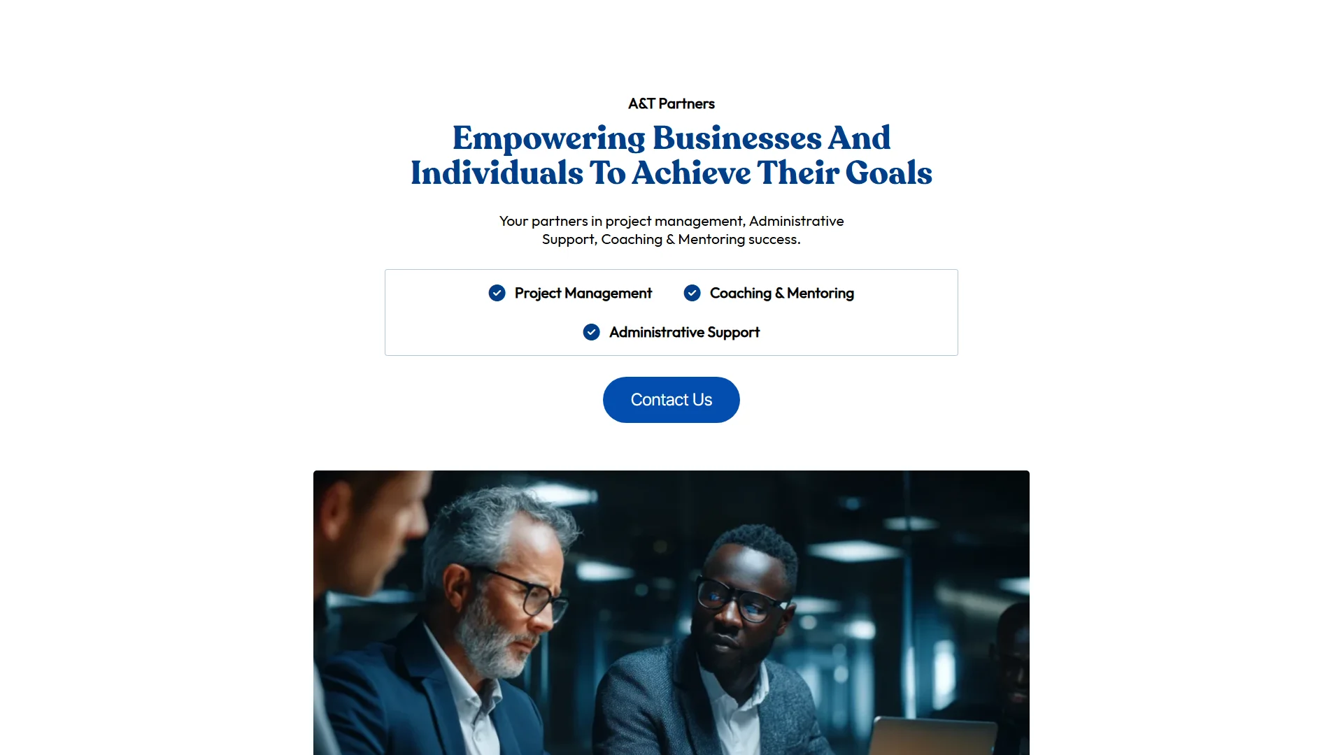
A&T Partners is a consultancy offering project management, coaching and mentoring, and administrative support. The owner wanted a single-page website and nothing more: what the practice does, the organisational detail behind it, and a contact form. The form was the critical piece — the entire page exists to get someone to it.
Where they began
A consultant who knew exactly what he needed and had no interest in more than that. One page, the essentials, and a form that works.
What was hard
The temptation with a one-page site is to treat it as a smaller version of a larger one. It is not. Everything a visitor needs has to be resolved in a single scroll, in the right order, with no navigation to fall back on and no second page to defer anything to.
There is also nowhere to hide. Across twenty pages a weak section goes unnoticed. On one page, every section is load-bearing — which makes a one-pager harder to get right than the thing people usually ask for instead.
What we built
The page is built as a single argument rather than a stack of blocks. It opens on what the practice is for, states the standard it holds itself to, then names the three things it actually does — project management, coaching and mentoring, administrative support — before giving the background someone needs in order to take it seriously.
Then it ends on the form, because that is the entire point of the site. Everything above exists to bring someone to it in a frame of mind to use it, so the form itself is short and the ask is small.
Deep blue on a pale ground and no more design than the content requires. For a consultancy selling judgement, restraint reads as competence — a busy site would have argued against him.
The key parts
4 features we would like to highlight
One page, one argument
Purpose, standard, services, background, contact — in that order, resolved in a single scroll. No navigation to get lost in and no second page holding the thing you actually wanted.

The form is the destination
The critical piece for the owner, and the page is built to deliver people to it. Short, with a small ask, positioned where someone has just finished being persuaded.

Three services, stated plainly
Project management, coaching and mentoring, and administrative support — named clearly rather than dressed up. Clients of a consultancy are looking for a fit, not a pitch.

Restraint as the design
Deep blue on pale ground, generous space, nothing decorative. For a practice selling judgement, a busy site would undermine the argument it is making.
What changed
A site the size of the business
He wanted one page and one page is what the practice needs — no pages to maintain that nobody reads, and nothing paid for that does not earn its place.
Everything resolved in one scroll
A visitor arrives, understands what the practice does and who is behind it, and reaches the form without a single click.
Proof that one page can be the right answer
Not a reduced version of a real website — the correct format for this business, executed properly.
In their words
Amazing service and would recommend for sure, I used the 7 day fast track package and my website was done in 4 days, fab!
Amazing service and would recommend for sure, I used the 7 day fast track package and my website was done in 4 days, fab!
Mohammed Towashir TawhidA and T Partners