Beyond Growth
#016c43
Signature
#0a2434
Ground
#ff3f33
Accent
#d7d2cc
Support
#000000
Type
Beyond Growth is a community-led consultancy that supports Black and Global Majority-led non-profits — charities, grassroots groups and social enterprises working across the VCFSE sector. We did the whole thing: the logo first, then the website. The job was to give a young organisation the presence of an established one, so that the charities it wants to help, and the funders and councils it needs to be taken seriously by, both arrive at the same conclusion in the first few seconds.
Where they began
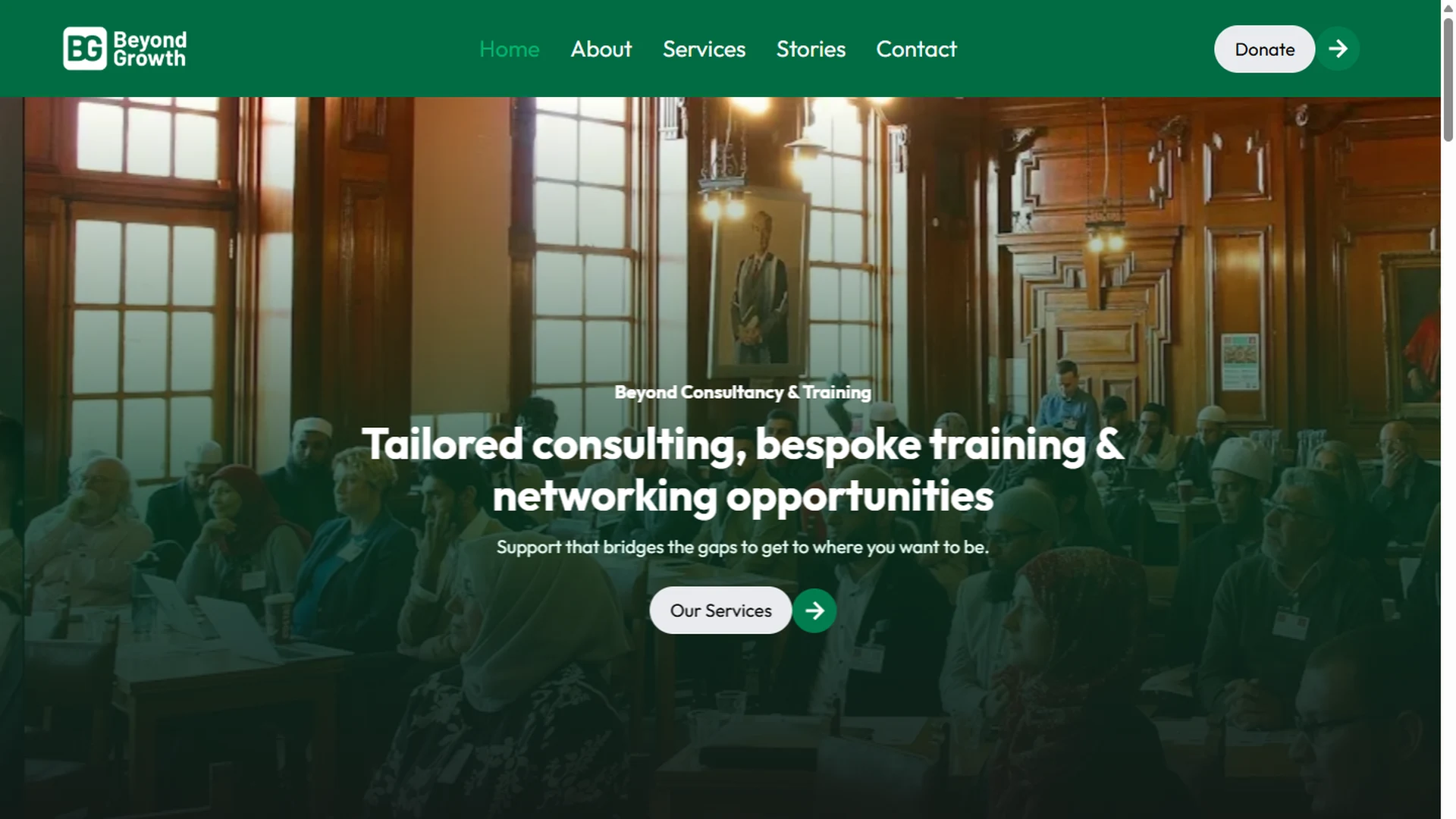
Beyond Growth was founded in 2024 by Mohammed Towhasir, after co-founding a grassroots organisation and seeing at first hand how little infrastructure, funding access and tailored support existed for Black and Global Majority-led non-profits. It started with no mark and no site. Everything a funder or a partner organisation would use to judge it still had to be built.
What was hard
A consultancy has nothing to photograph. The work is consulting, training, mentoring and introductions — all of it real, none of it visible — so the site had to make intangible services feel concrete and specific rather than a list of nouns. It also had to speak to two audiences at once without pulling in two directions: the non-profits who need the help and have to feel understood rather than sold to, and the funders, councils and partners who need to see an organisation worth backing. And it had to do that for an organisation with no track record on display yet, where credibility could not be inherited and had to be constructed.
What we built
The mark came first, because everything else would sit on it. BG is set as a monogram in a soft-cornered square, so it holds at avatar size on the social accounts as well as it does across a letterhead — deep green doing the work, no illustration to fall apart when it shrinks.
The site was then built in Bricks on Automatic.css, so the palette and spacing come from tokens rather than being typed in per section — which is what lets a small team keep it consistent after handover. The structure follows the organisation's own three pillars rather than a generic services menu: strengthening organisations, advancing professional development, fostering collaborative networks. Each service was given a concrete face — workshops and seminars, online courses, guides and templates, research and reports, events and community platforms — so a visitor can see what they would actually receive.
The founder's story was given real space on the About page rather than being compressed into a line, because in this sector the reason someone started matters as much as the offer. Client voices run as their own section in the organisations' own words, and the journal carries the arguments the sector is having — funding, visibility, what councils and funders should do — which is what makes the site worth returning to rather than reading once.
The key parts
7 features we would like to highlight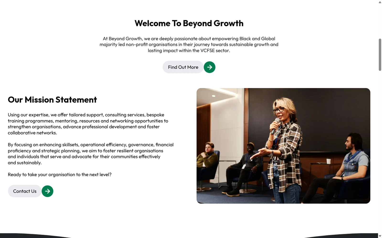
One mission, said plainly
The home page opens on a rotating set of statements rather than a stock welcome, each one over a photograph of the actual rooms this work happens in. The mission is then restated in a single paragraph, so nobody has to hunt for what the organisation is for.
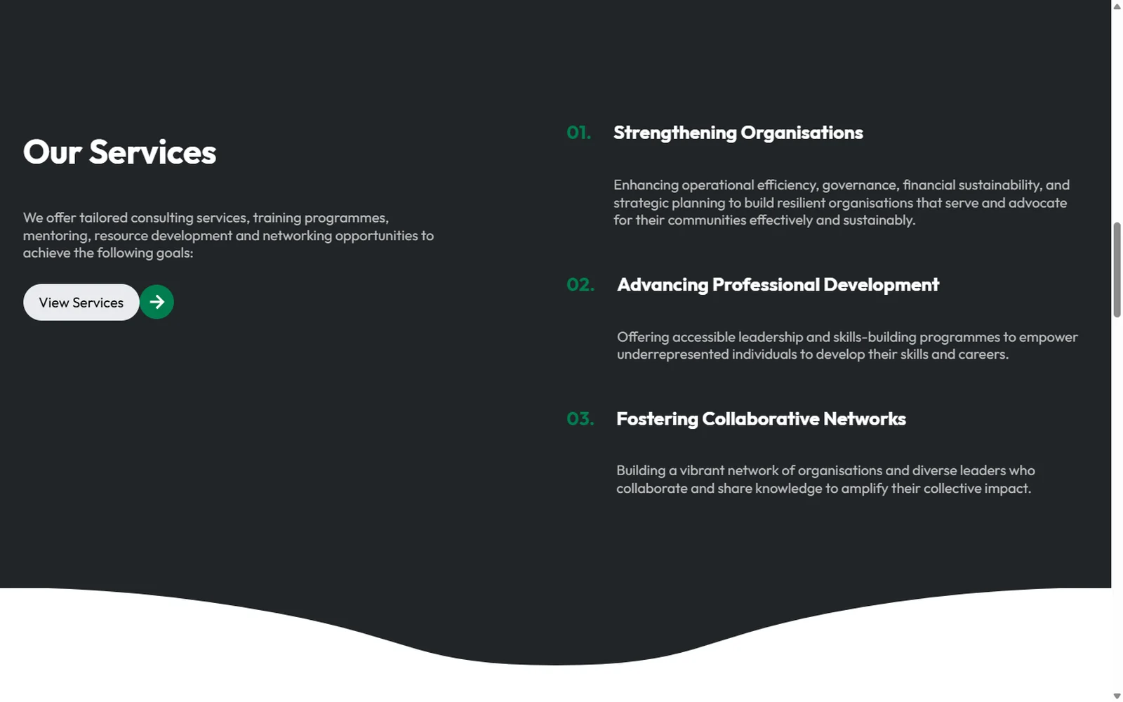
Three pillars, not a services list
The offer is organised around the organisation's own three aims — strengthening organisations, advancing professional development, fostering collaborative networks — numbered and set on a dark band so they read as a position rather than a menu.
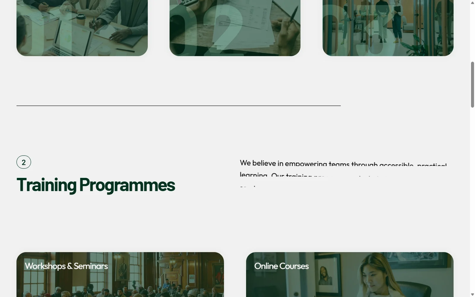
Services made tangible
Consulting, training, resources and networking each get their own numbered section with the specifics named underneath: organisational development, financial management, HR, workshops, online courses, guides, templates, research, events. Intangible work made countable.
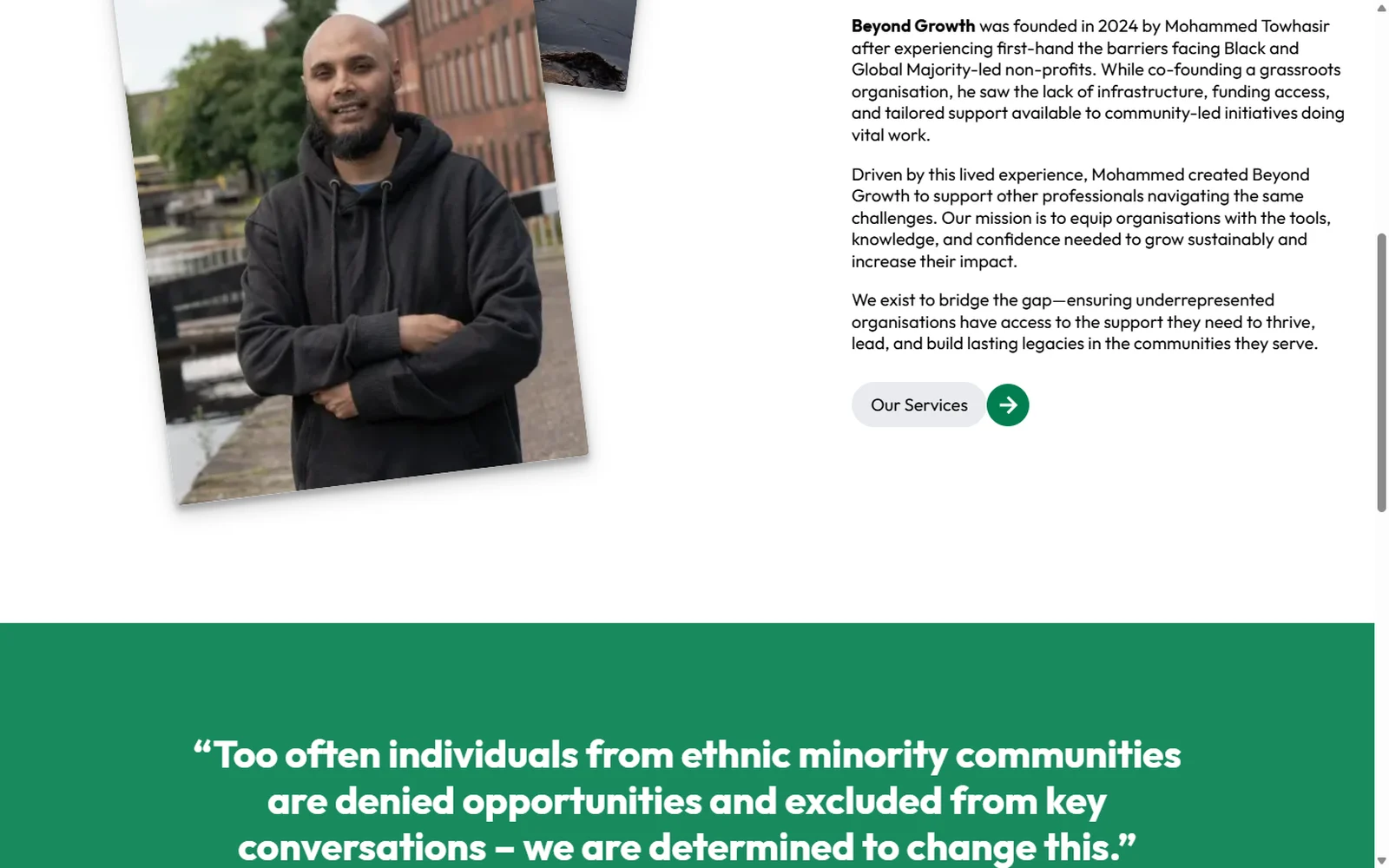
The founder's story, given room
Founded in 2024 after the founder co-founded a grassroots organisation and hit the same barriers his clients hit. That story sits on the About page with a portrait and a pull-quote, because in this sector the why is part of the credential.
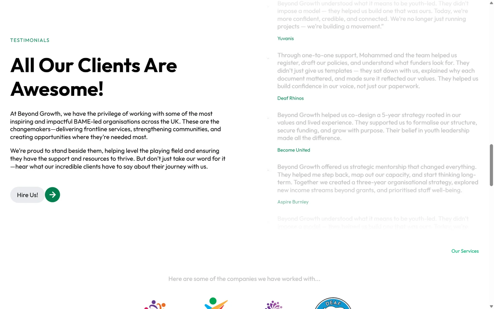
Clients in their own words
Testimonials from the organisations themselves — named, specific, and about what actually changed. They run in a continuous column rather than a carousel you have to click through.
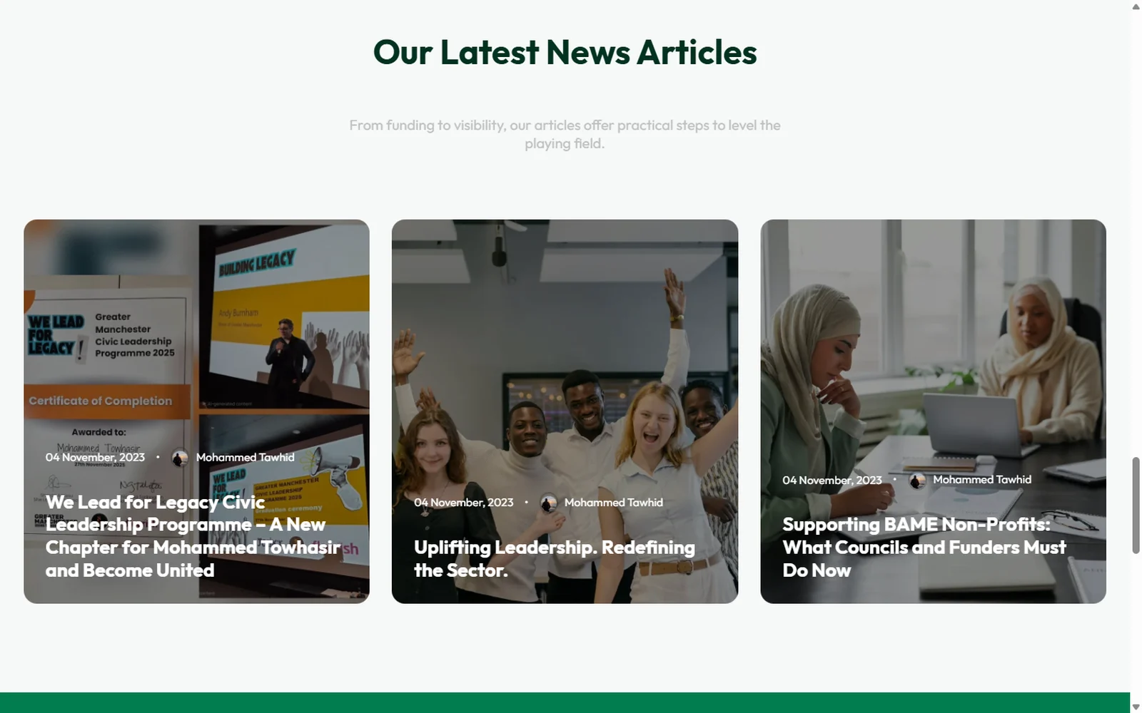
A journal that does the arguing
Articles on funding, visibility and what councils and funders should do now. It gives the organisation a voice in the sector's arguments rather than only a shopfront.
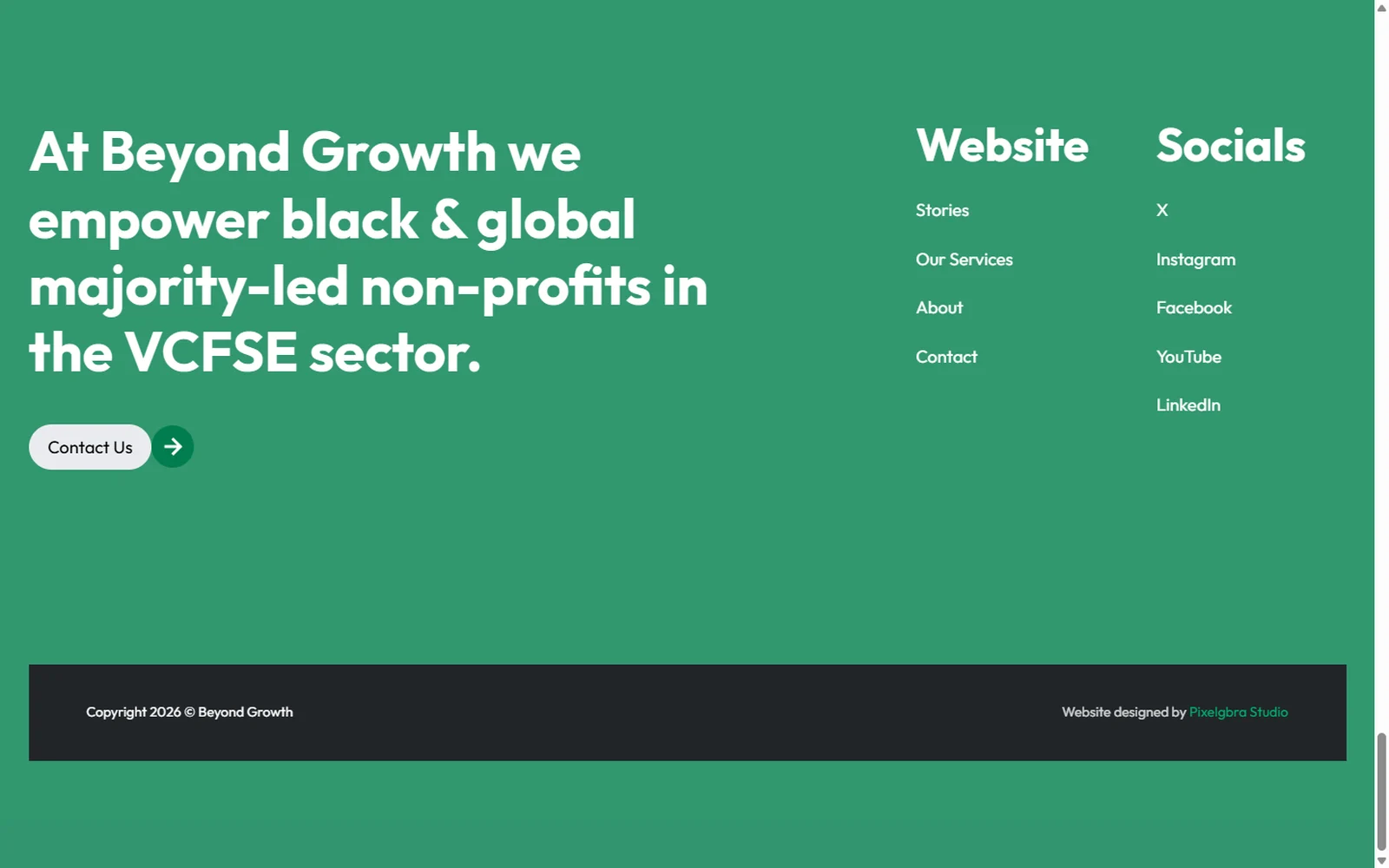
A close that asks for the conversation
The site ends on a full green band restating who it exists for, with contact one click away — the mission and the invitation in the same breath.
What changed
A new organisation that reads as an established one
Founded in 2024, with the site and mark it needed to approach funders, councils and partner charities without having to explain itself first.
Invisible services made legible
Consulting, training, resources and networking are each shown as something a visitor would actually receive, rather than four abstract nouns on a services page.
One identity that works everywhere
The BG monogram holds from a social avatar to a full lockup, so the organisation looks the same wherever it turns up.
A platform they can keep filling
Built on tokens in Bricks with a journal and a testimonials section, so the team adds articles and client voices themselves without the design drifting.
In their words
They truly understood our brand and brought it to life online.
Pixelgbra Studio did an outstanding job creating Beyond Growth’s new website! The team combined creativity, technical skill, and clear communication to deliver a site that’s modern, fast, and easy to use. They truly understood our brand and brought it to life online. We couldn’t be happier with the result and highly recommend Pixelgbra Studio to anyone looking for top-quality web design and development.
Beyond GrowthBeyond Growth