EverFit Coaching
#4bab7e
Primary
#e4572e
Accent
#232b36
Base
#1c242f
Support
#3a4658
Support
#f7f7f8
Ground
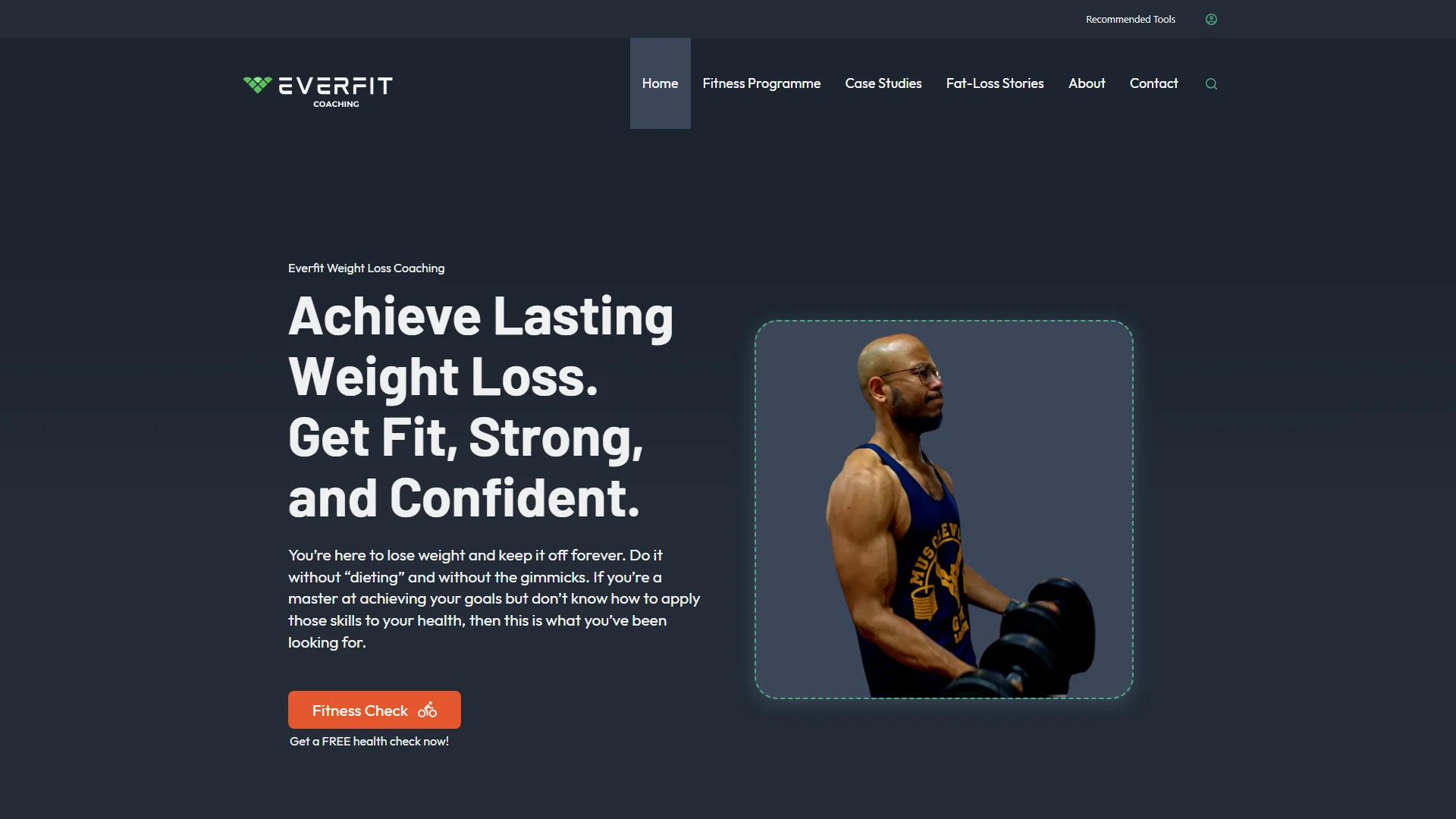
EverFit Coaching is Azad's fitness and fat-loss coaching practice, working exclusively with men. We built the site to carry the work: case studies of the clients he has taken through the programme, the fat-loss stories behind those results, a blog covering the tools he recommends, and a fitness check in the hero that is useful to the visitor and builds his mailing list at the same time.
Where they began
A coach whose results are the proof, working in a category with a very narrow visual vocabulary. The site had to read as unmistakably his — and unmistakably for men — without settling for the register most fitness sites reach for.
What was hard
Fitness coaching is crowded and it all looks the same: dark, loud, interchangeable. Azad works only with men, so the site had to say that the moment it loaded, without becoming another page shouting about transformation. Masculine, but not a supplement advert.
The second problem was the first move. Someone who is interested but not yet ready will leave and will not come back. There had to be something at the top of the page worth doing immediately — something genuinely useful to them, and useful to him.
What we built
Azad's own judgement shaped this more than most projects. We wanted his read at every stage, because a coach's site has to sound like the coach or nobody believes it.
The look is built on weight rather than volume — a dark slate ground, one green carrying the brand, and a burnt orange used sparingly on the things that actually matter. Masculine by construction rather than by cliché.
The case studies do the persuading. Real clients taken through the programme, with the story behind each result rather than just a before and an after, because the story is the part a prospective client recognises himself in.
The fitness check sits in the hero and does two jobs at once. For the visitor it answers a question they already have about themselves, so it is worth the thirty seconds. For Azad it is the top of the funnel: it grows the mailing list and hands him someone already thinking about their own numbers, rather than a name on a form.
The key parts
4 features we would like to highlight
The fitness check
The hero's call to action, and the best thing on the site. It gives a visitor something genuinely useful about themselves in return for an email, which means the mailing list grows with people who are already thinking about their own numbers rather than names collected from a newsletter box.

Case studies with the story attached
Real clients taken through the programme, with the fat-loss story behind each result rather than a before-and-after pair. The story is what someone considering it recognises himself in.

Masculine without the cliché
He works only with men and the site says so immediately — through weight, contrast and restraint rather than volume. Dark slate ground, one green, one orange used sparingly.

The tools he actually recommends
A blog covering what he suggests his clients use, so the advice keeps working between sessions and gives people a reason to come back before they have signed up to anything.
What changed
A call to action that earns its place
The fitness check gives something away before it asks for anything, which is why it converts — and why the list it builds is worth having.
Proof that reads as real
Case studies with the story behind them rather than a wall of transformation photographs, which is the difference between being believed and being scrolled past.
A site that sounds like him
Built with his input throughout, so the tone is the coach's rather than the agency's — which for a one-man practice is most of the trust.
Distinct in a category that is not
A masculine, high-end look achieved with restraint, in a field where nearly everyone reaches for the same loud template.
In their words
I don't think I could have got a better service or value elsewhere! Overall, I'd summarise as an excellent service with an honest, reliable and responsive developer.
Having worked with a fair few website developers and designers, I was pleasantly shocked by the efficiency, professionalism and ease of working with Pixelgbra. Previously, I had a off the shelf type of Wix/GoDaddy style website that was clunky and didn't quite feel right. I wasn't sure if it captured the aims and ethos of my business. My new website by Pixelgbra was taken from an idea, to first stage design in a matter of days. The best part of it is, Pixelgbra diligently researched my brand, my products and understood the aim that I was trying to fulfil. My input was effortlessly taken in their workflow and the developer was able to determine exactly what would work for my business. Not only did he create a great website, there were plenty of suggestions of how my business can be marketed, streamlined and improved. I found the developer really easy to work with, as the feedback process uses specific platforms that allows me to see my websites design concept and give live suggestions. I don't think I could have got a better service or value elsewhere! Overall, I'd summarise as an excellent service with an honest, reliable and responsive developer.
Azad HussainEverFit Coaching