FinTech Teens
#c77f40
Primary
#edad80
Support
#f0334a
Accent
#1a1712
Dark ground
#fcf6ef
Light ground
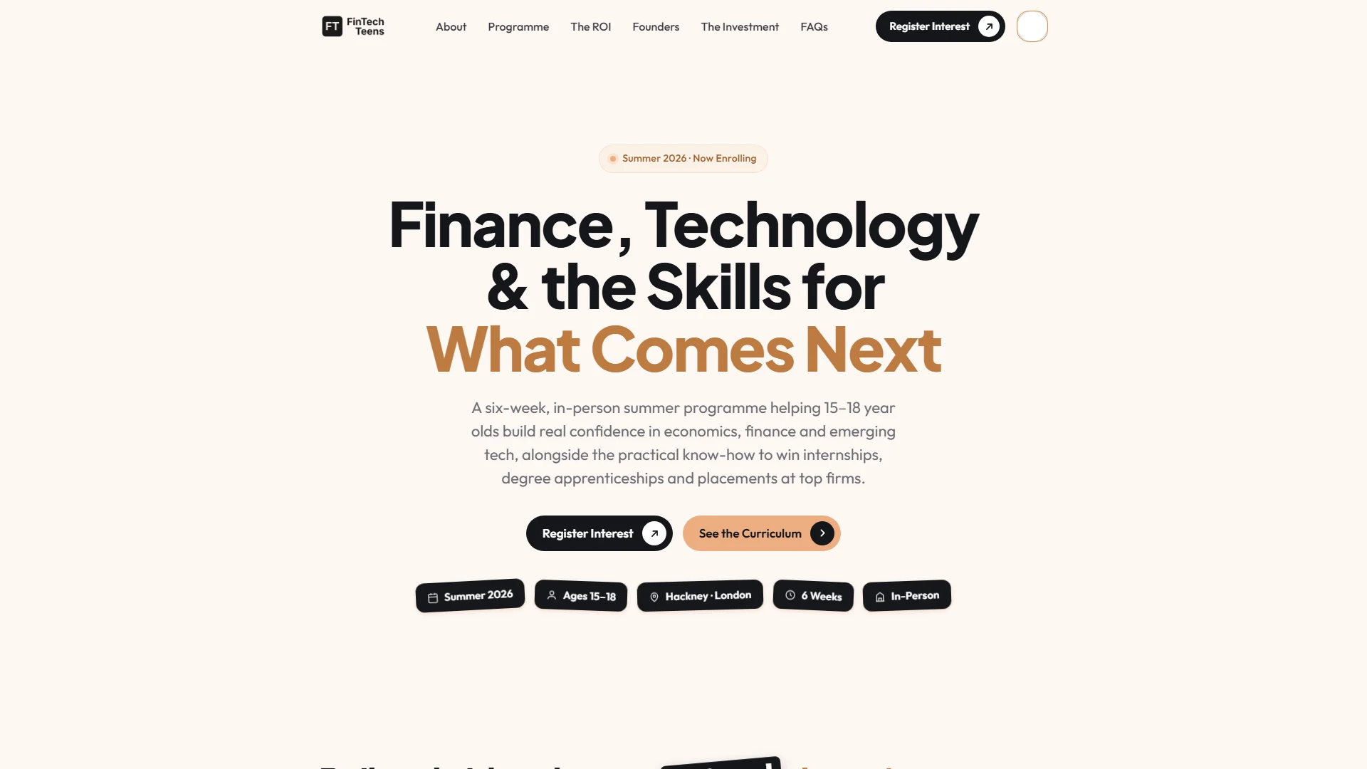
FinTech Teens is a summer course in finance, investing and AI for 15 to 18 year olds in Hackney, London, run by two university students who wanted the thing they never had. We built the site as a single page and wrote all of the copy — which is not true of anything else in this portfolio. It ships with a dark and a light mode, animation carrying the whole page, and a register-interest link straight to WhatsApp.
Where they began
Two students with a course, a genuine reason for running it, and nothing written down. No copy, no site — the idea and the conviction behind it, and that was all.
What was hard
The audience is split in two. Teenagers decide whether this is something they want to do; parents decide whether it is worth paying for. The page has to speak to both without patronising either, and it is the parent who acts.
There was also no copy at all, which is a larger job than it sounds. The most persuasive thing about this course is the founders' own reason for running it — that they wished it had existed when they were the age of the people they are teaching. That had to be drawn out and written, not handed over.
And all of it has to resolve in a single scroll.
What we built
We wrote it. All of it. That is what separates this build from the rest of the work here — the page was not filled with supplied copy, it was authored, which meant working out what the course actually is before designing anything to hold it.
The line that carries the page belongs to the founders: two students who wished this had existed for them. It is the entire argument for the course and the reason a parent believes it, so the page is built around it rather than leaving it buried in an about section.
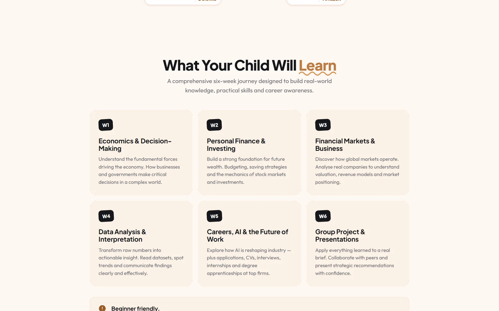
The structure follows the parent's questions in the order they ask them — what this is, what it covers, who is running it, what their child will actually come away with — and then the ask.
Registering interest goes to WhatsApp rather than a form. For this audience and a decision made this quickly, a message is a far lower barrier than a form, and it lands somewhere two students running a course will actually see it.
Both a dark and a light mode ship, and animation carries attention down the page. On a one-pager, motion is what replaces a navigation bar.
The key parts
5 features we would like to highlight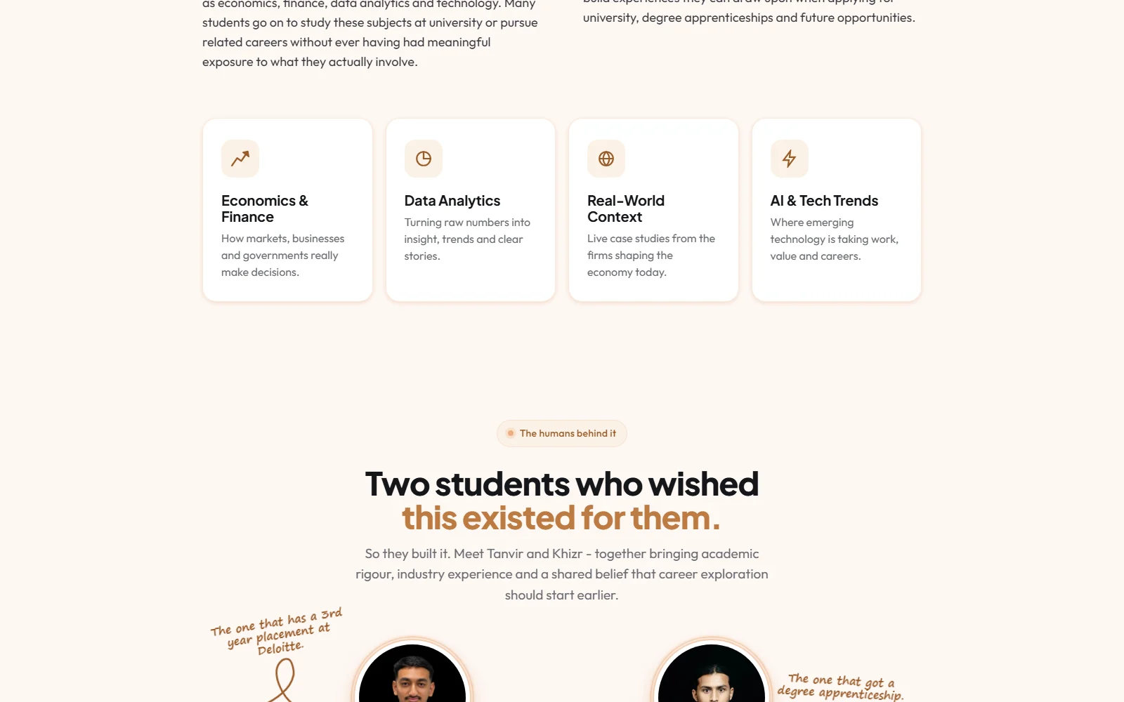
We wrote every word
The only project here where the copy is ours as well as the design. That meant working out what the course actually is before a single section was built — and it is why the page argues for itself instead of describing itself.
One page, two audiences
Teenagers decide they want it; parents decide to pay for it. The page speaks to both in the order the questions get asked, without talking down to either.
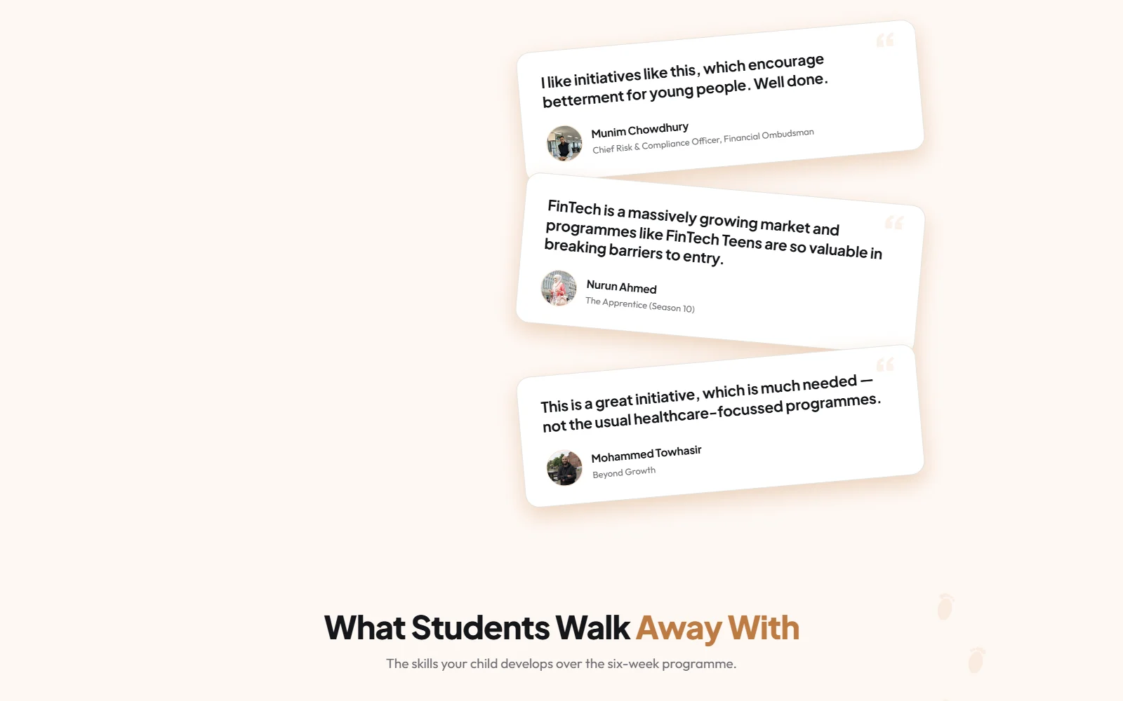
Dark and light modes
Both ship, properly built rather than a filter over the top. The audience lives on phones set to whichever they prefer, and the page respects that.
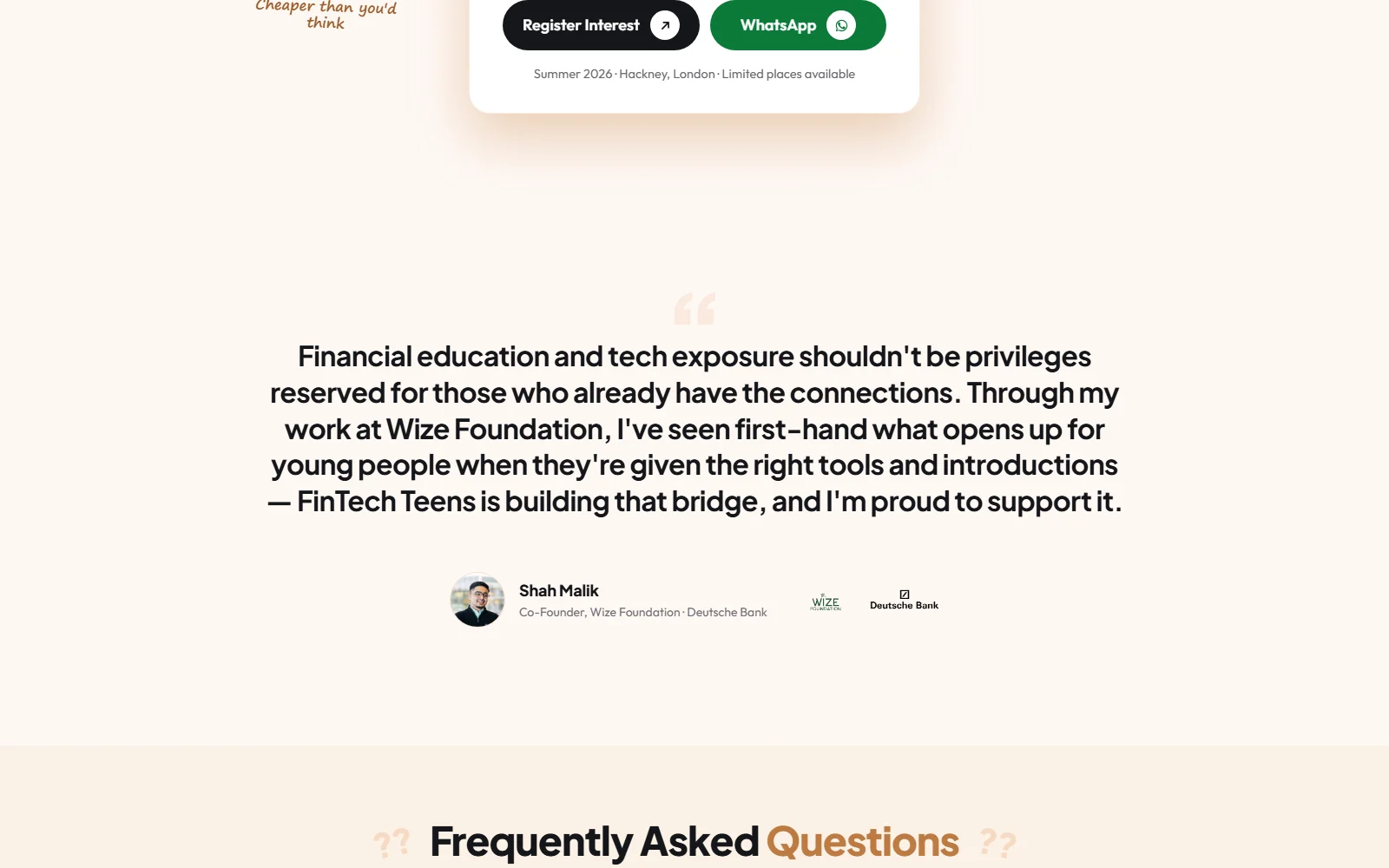
WhatsApp instead of a form
Registering interest is a message, not a form submission. Lower barrier for the age group, and it arrives somewhere two students running a summer course will genuinely see it.
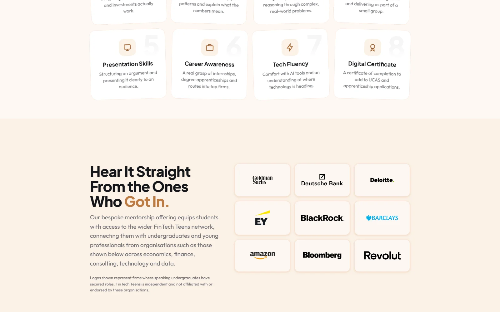
Animation doing navigation’s job
On a single long page there is no menu to orient anyone, so motion carries attention from one section to the next and signals that there is more below.
What changed
A course explained by the people who wanted it
The founders' own reason for running it became the spine of the page rather than a footnote — which is the most convincing thing they have.
Two audiences, one scroll
Teenager and parent both served on a single page, with the parent given what they need at the point they need it.
A lower barrier to the first message
WhatsApp instead of a contact form, matched to how this audience actually starts a conversation.
Copy and design made together
Written and built as one job, so the words and the layout were never fighting each other for the same space.
In their words
FinTech Teens